I think this is a really good example of avoiding mergers because its confusing how all the other stuffs are in the picture and its not focusing on only one thing.
Thursday, September 26, 2013
Framing
I chose this picture as an example of framing because the water is the one that is framing the buildings on fire.
Balance
I like this picture as an example of balance because its cool how the guy is just standing there with out moving.
Lines
I chose this picture as an example of lines because of how the lines are show in the building and how the smoke is on the back.
The Rule of Thirds
I chose this picture as a example of the rule of thirds because i like it how it got the smoke coming out of the building from the two sides.
Simplicity
I chose this picture as an example of simplicity because of how the background is the sky and its just focusing on the building.
Tuesday, September 24, 2013
Elements of Art and Principles of Design in Photography
Elements of Art photography
- Lines- are marks made by a pointed tool: brush, pencil, pen, etc. Lines can vary in width, direction, curvature, length, or color.
I chose this photo because it shows of the clear lines of the piano.
I chose this painting because it shows the lines of the totem poles.
- Shapes are formed wherever the ends of a continuous line meet. Geometric shapes such as circles, triangles or squares have perfect, uniform measurements and don't often appear in nature. Organic shapes are associated with things from the natural world, like plants and animals.
I chose this picture because it shows the shape of the apple and the heart.
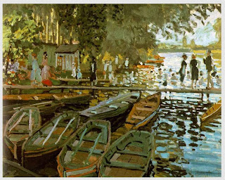
I chose this painting because it shows the shape of the trees and the rowboats.
- Color wheels show the primary colors, secondary colors, and the tertiary (intermediate) colors. They also show the relationships between complementary colors across from each other, such as blue and orange; and analogous (similar or related) colors next to each other such as yellow, green, and blue. Black and white may be thought of as colors but, in fact, they are not. White light is the presence of all color; black is the absence of reflected light and therefore the absence of color.
I chose this picture because it shows the colors that are in the bubble.
I chose this painting because i like how it shows the stars and alot of other colors.
- Value, or tone, refers to dark and light; the value scale refers to black and white with all gradations of gray in between. Value contrasts help us to see and understand a two-dimensional work of art.
I chose this picture because i like how it shows the little girls dancing.
I chose this painting because its just cool how it shows his reflection.
- Form describes objects that are three-dimensional, having length, width, and height.
I chose this picture because I like how you can see the eye of the person and it just looks really awesome.
I chose this painting because it its cool how they look like heads.
- Texture can be rough, bumpy, slick, scratchy, smooth, silky, soft, prickly--the list is endless. Texture refers to the surface quality, both simulated and actual, of artwork.
I chose this picture because the picture looks soft and smooth.
I chose this painting because it looks really good and it looks smooth.
- Space refers to distances or areas around, between, or within components of a piece. Space can be positive (white or light) or negative (black or dark), open or closed,shallow or deep, and two-dimensional or three-dimensional.
I chose this picture because of how you can see the space between the stair.
I chose this painting because of how you can see the space between the totem poles.
Principles of Design photography
- Balance is the comfortable or pleasing arrangement of things in art. There are three different types of balance: symmetrical, asymmetrical, and radial. The human figure is symmetrically balanced; the same on the left and right side. The tree is asymmetrically balanced; its branches are not distributed equally on each side, but their total weight is balanced left and right. The sun is an example of radial balance; all its rays are equal in length from the center.
I chose this picture because of how you can see the balance of the rocks.
I chose this painting because of how you can see the too persons standing up and not moving and having a lot of balance.
- Contrast is created by using elements that conflict with one another. Often, contrast is created using complementary colors or extremely light and dark values. Contrast creates interest in a piece and often draws the eye to certain areas. It is used to make a painting look interesting.
I chose this picture because its cool how the apple is green and the rest is black and white.
I chose this painting because of how you can see the flowers have a color and the men has only white and black.
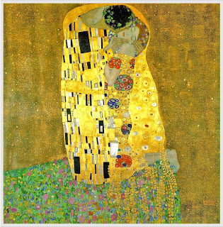
- Emphasis in the focal area of an artwork gives it importance. An artist may stress some elements of the design over others. The eye of the viewer will focus on the area of emphasis or center of interest first, then take in the rest of the composition.
I chose this picture because its just focusing on one thing.
I chose this painting because of how it just focus on the Mona Lisa.
- Movement in an artwork means the artist is taking viewers on a trip through the work by means of lines, edges, shapes, and colors often leading to the focal area. Movement is a visual flow through the composition. It can be the suggestion of motion in a design as you move from object to object by way of placement and position. Directional movement can be created with a value pattern. It is with the placement of dark and light areas that you can move your attention through the format.
I chose this picture because of how the horse is moving.
I chose this painting because of how the ocean is moving.
- Patterns are made in art when the same shapes or
elements are repeated again and again. Pattern uses the elements of art
in planned or random repetitions to enhance surfaces of paintings or
sculptures.I chose this picture because of how it shows the pattern of the lines.I chose this painting because of how it shows the pattern of the squares and lines.
- Rhythm is the repetition of shapes, lines, and forms.
Rhythm is a movement in which some elements recurs regularly. Like a
dance, it will have a flow of objects that will seem to be like the beat
of music.
I chose this picture because of how a line is made of with the color pencils.I chose this painting because of how the shapes are made.
- Unity means that all elements in an artwork are in
harmony. Unity brings together a composition with similar units. For
example, if your composition was using wavy lines and organic shapes you
would stay with those types of lines and not put in even one geometric
shape.
I chose this picture because it shows how the boat and the water are elements in an artwork.I chose this picture because of how the boats and the water are together as an element in an art work in harmony.
Friday, September 20, 2013
40 Greates Photos Ever
 Australian Scott Jones kisses his Canadian girlfriend Alex Thomas after she was knocked to the ground by a police officer’s riot shield in Vancouver, British Columbia. Canadians rioted after the Vancouver Canucks lost the Stanley Cup to the Boston Bruins.
 - I picked this picture because its cute how after being knocked to the ground by an officer he went and kissed his girlfriend.
- How the photographer made everything else blurry and they guy and his girlfriend aren't .
- Because its just cute how they shoot the photo and how the light hits them.
A Romanian child hands a heart-shaped balloon to riot police during protests against austerity measures in Bucharest
- I choose this picture because its cute how the little boy gave the balloon to the police officer.
- how they took the picture of the little boy giving the balloon to the officer and than they took a picture of the officer with the balloon.
- I think this made the 40 top wonderful pictures because its cute how the officer wasn't mean or anything to the little boy and he actually got the balloon and he keep it . Eight-year-old Christian Golczynski accepts the flag for his father, Marine Staff Sgt. Marc Golczynski, during a memorial service. Marc Golczynski was shot on patrol during his second tour in Iraq (which he had volunteered for) just a few weeks before he was due to return home.
- What made you pick the photo? I choose this picture because its just cute how they are giving the flag of his father to the little kid after he got shot on patrol during his second tour in Iranq.
- Its just really cute how they give it the his son and the little kid is doing anything he can to not cry.
- I think this made the 40 top powerful pictures because its really touchable of how they are actually trying to explain to the little kid about his dad and giving him his flag.
Photo Manipulation and ethics
The first day in April is called April Fool’s Day in the United States.However, when Kahana’s image appeared in Yated Neeman, an ultra-Orthodox Jewish newspaper, someone had fooled with the image.
Someone at the newspaper used Adobe Photoshop or a similar software program to remove female ministers Limor Livnat and Sofa Landver and replaced them with two men to create an all-male cabinet.
Los Angela Times staff photographer Brain Walski was fired ironically on April 1,2003. The international award winning 20 years news veteran combined elements of two photographs of a British soldier , taken moments apart in order to improve the composition of the imaje , it cost him his job and his credibility , however , few lessons were learned by other. I think this type of photo editing is unethical because its bad to photo edit pictures with out someone else knowing .
I think this is unethical because on the top of the ladys head used to be a pole and you can see that its kinda blurry.
I think this picture is least unethical becuase they actually try to cover the guy in the white and you cant not really see that the covered him.
Wednesday, September 18, 2013
Post Shoot Reflection
I like how the Happy picture came out how they really got a good angle of the picture and how from the back it looks kinda of blurry.
The metal one it actually looks good , and the red one looks good , the way she got all the hallway it looks actually good .
http://breezephotojournalismblog.blogspot.com/
The metal one it actually looks good , and the red one looks good , the way she got all the hallway it looks actually good .
http://breezephotojournalismblog.blogspot.com/
National Geographic Photo
I like this picture because i like how they actually took the picture and how the eye looks like and how you can see through her eye and how everything else is blurry .
Subscribe to:
Comments (Atom)


